Understanding the limitaion of the television ident
Typography
When creating idents, there can be limitation when it comes to designing idents. One of these limitations when it comes to creating idents, it typography is what is used to create idents. A limitation with the font is that if a TV channel uses swirly with their ident, not allfonts will translate properly this could then cause the typography to appear broken up or pixilated. This could cause the audience to not be able to read the text, as the font being used is difficult to read and not be able to take in all the information that is being displayed on their screen because of this.


Colour
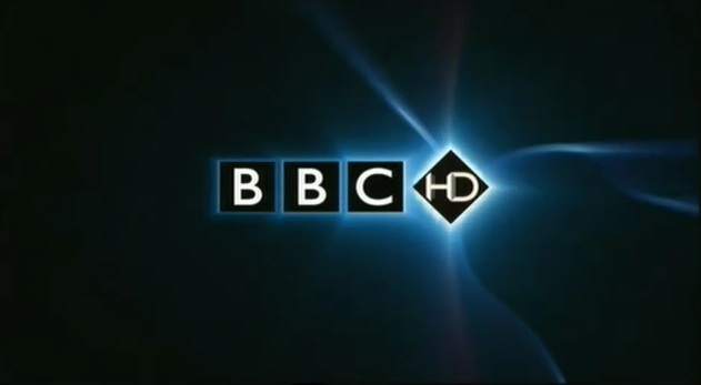
Colour is really important for designing the idents as it is a key factor of recognising a brand. It may be more effective than a logo in some cases. For example, white and purple are used for E4 and red and white is used for BBC One. Certain colour are reflected by mood, personality, theme and style of a channel so choosing the correct colour needs to reflect on the channel.

Aspect Ratio
The screen aspect ratio has an effect on the overall design, as the designer will be producing a ident for a specific shape. For example, there will be people watching television on the computer, wide screen or HD television, which will use a 19:9 ratio which means that there will be a stretching the ident outwards and squashing it inwards and altering the look of the design. Also, this means that the ident may not actually be able to be shown in some cases.
Duration
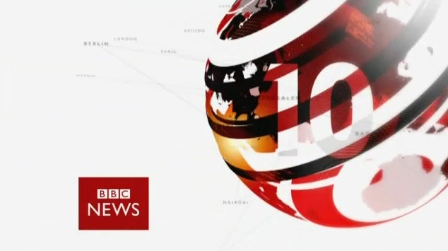
The time length of the idents for the BBC news is different, some being shot as 5 seconds or 25 seconds but all still manage to express the same thing as the channel. The adverts tends to be longer when the channel is introducing shows that will be on later on that day.
Adhering to a desired tone

The ident for each individual channel has to correspond with the channel's genre or style. BBC Three has a comical animated to reflect on its humorous shows such as Family Guy and American Dad.


The right tone has to be set for the different target audiences.
For example, BBC Three's ident gives a bright and lively tone showing that it's more targeted to teenagers. It uses a mixture of bright lights, purple and blueish vibrant, fast and exciting music, movement, done with animated scenery and characters. The tone is created from the artistic taste of the ident such as the movement, colour, sound, etc.


That concludes the Task
A good start but please finish this post.
ReplyDelete